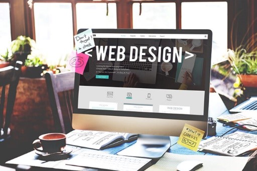
11 Ways to Make Your Website Design Pop
A well-designed website is key to creating a great first impression and attracting potential customers. To do this, there are some creative ways to give your website design the perfect pop. Using colors that complement each other and make content stand out, adding subtle animation effects that catch the eye without being distracting, allowing users to customize their experience on the site, selecting fonts that look great but legible, and loads more can all be implemented for maximum effect. With an emphasis on intuitive design that looks pleasing and resonates with your target market, these strategies will guarantee a positive reaction from visitors. Creating a website that stands out from the rest can be challenging. It takes creativity, an eye for design, and knowledge of web development to create an aesthetically pleasing and functional website. Luckily, there are some simple tips you can follow to make your website design pop and attract more visitors.
Utilize White Space
Too many elements on one page can lead to clutter and confusion. When designing your site, use white space strategically to help direct attention to the most important elements on the page. This will also construct it easier for users to navigate your site. If you sell area rugs, for example, try using white space to emphasize the colors and designs of each rug. You can also use white space to create a sense of calm and make the page look more organized.
Choose the Right Fonts
Choosing the right fonts is key to making your website design stand out. You want to choose fonts that are easy to read but, at the same time, not too boring or generic-looking. The best way to do this is by experimenting with different font combinations until you find one that works for you and your brand. For example, pairing a bold font with a more delicate one can create an interesting contrast, while using two similar fonts can help bring consistency to your site.
Use Color Strategically
Color plays an important role in any website design as it helps guide users’ eyes in certain directions and can evoke certain emotions and feelings in people when used correctly. When selecting colors for your website, it’s important to use them strategically so they don’t overwhelm visitors or cause distractions from what they should focus on while browsing your site. For example, try using a brighter or more intense color palette to draw attention to a certain area. On the other hand, if you desire to create a calming atmosphere for visitors, stick with softer colors like pale blues and greens.
Pay Attention to Typography
Typography should not be overlooked when creating a website design that pops! Be sure you’re using high-quality fonts that match your site’s style and choosing appropriate font sizes so everything is readable without being too small or hard to read due to being too large! Like color, typography can evoke certain emotions in visitors. Be sure to consider the feeling you want your webpage to give off when selecting fonts and font sizes.
Don’t Forget About Mobile Design
With over half of all web traffic reaching from mobile devices, you must also pay close attention to how your site looks on mobile devices! Please ensure all text is legible, images are optimized for smaller screens, and buttons are big enough for fingers, etc., so users have a great experience no matter their device! For example, you’ll likely want to use a different font size or weight on mobile than desktop. Finally, it’s important not to forget page loading times when designing your webpage. If a page assumes too long to load, users will likely navigate elsewhere and might never see the great design you’ve created!
Incorporate Visuals
Visuals are a great way to draw people into your content and add interest without distracting from the main message or point you’re trying to get across with each website page! Images, videos, infographics, charts—all these things can help break up long blocks of text while still interestingly providing valuable information! If your website belongs to Hand Knotted Rugs, adding visuals of hand-crafted rugs can give customers an idea of what they might get if they buy from you.
Use Animations Wisely
Animations can be used sparingly throughout a website design to add visual interest and make pages come alive with motion! Remember not to go overboard—too much animation can quickly become distracting or annoying if overdone! For example, you could use animations to show off product features or demonstrate a process. If you have a product that needs to be assembled, you could create an animation that shows customers how it fits together.
Avoid Autoplay Videos/Audio
Autoplay videos/audio can easily become annoying if not done properly or used sparingly throughout a site’s design—so avoid using them unless necessary (like on product pages where customers need detailed information about each item before making a purchase). For example, if you’re selling a complicated piece of machinery, including an autoplay video explaining the product’s features and functions may be helpful. When done correctly, animations and videos can add an extra layer of engagement to your website or blog. They can help customers better understand products or services, navigate a site more easily, and quickly find the necessary information.
Leverage SEO Best Practices
SEO is essential when creating any web presence. Ensure you leverage SEO best practices throughout every page on your site by optimizing titles & meta descriptions and utilizing heading tags & alt tags whenever possible (and relevant). For example, if you have a product video, include relevant keywords in the title and description on YouTube.
Include Social Media Integration
Social media integration helps drive more traffic toward your website, which means more potential customers see what you have available—so include links & icons leading straight back toward social media profiles like Facebook & Twitter wherever possible (but again, don’t go overboard here either)! For example, if you’re writing a blog, add social media sharing buttons at the bottom of each post.
Make Navigation Easy
Last but certainly not least—make sure navigation between pages is easy & intuitive by creating menus/submenus with clear labels & directions, so users know exactly where they will be taken after clicking any given link within each content page! For example, clicking “About” from the homepage should take users to a page describing your business. They should not be taken to a page with contact information or anything irrelevant.
Conclusion
A great-looking website isn’t just about flashy visuals; it’s also about providing a great user experience through easy navigation & helpful content that answers questions quickly & efficiently without leaving people feeling confused or overwhelmed by too much information at once! Follow these 11 tips to ensure your website stands out among the rest & attracts more visitors than ever! RugKnots, a rug company in business since 2004, is a great example of how focusing on website optimization can create an amazing user experience. They have ensured that their website is visually appealing, easy to navigate, and contains useful content. They have implemented various features, such as interactive product images and a helpful FAQ section, making it easier for customers to quickly find the information they need.


